credit to The Evolution of the Freccione (watchprozine.com)
The Evolution of Rolex 1655(the Freccione)

Our dear Amanico has already made a great in depth review of the Freccione a couple of months ago:
but I wanted to add a few personal comments as well as pictures of this watch and its evolution during its production period.
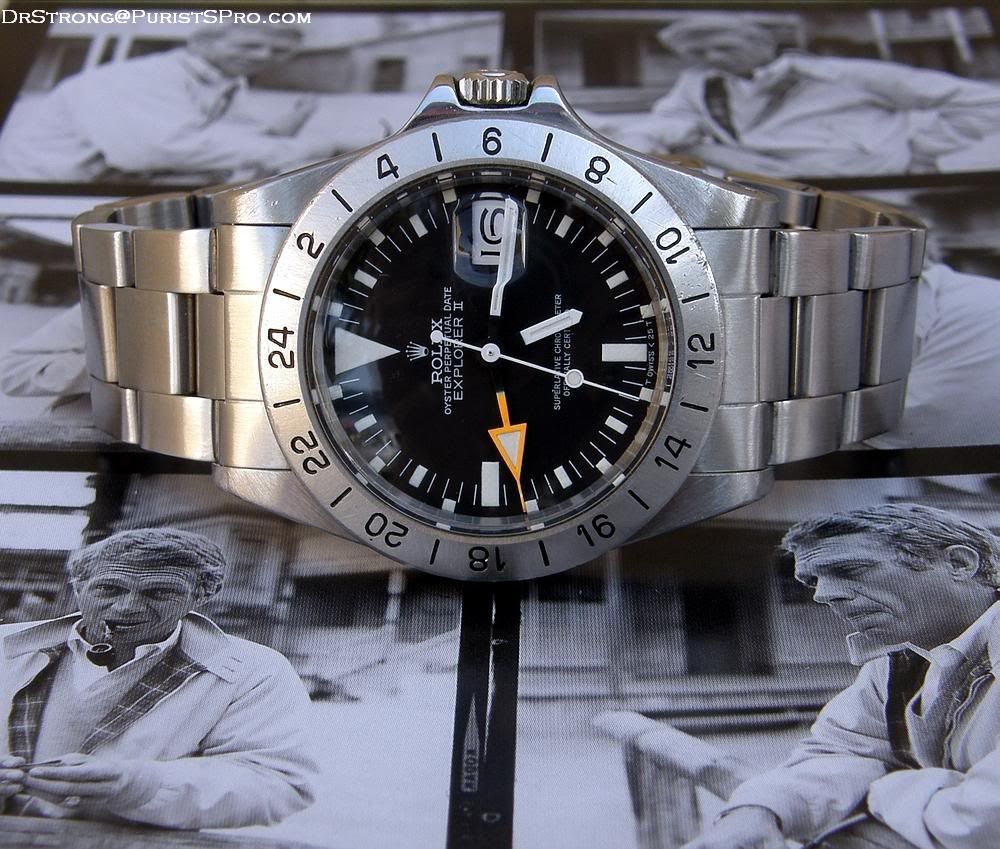
The Rolex Explorer II ref. 1655 has been produced from 1971 to 1984. Compared to the already existing Explorer I, the watch has been upgraded with the date feature and a 24 hours indication using an additional orange hand and an external graduated bezel. The movement used in this watch is cal. 1575.
From 1971 to 1974, the watch was fitted with a straight sweep second hand (without a tritium dot) and a case with almost “pointed” crown guards; the crown guards were not as small as on the first Submariner or GMT-master, but they were definitely smaller than on the other Rolex sports models of 1971 and than on the later case version of ref. 1655. The bezel used thick font with the numbers close to the dial ("thick font top").
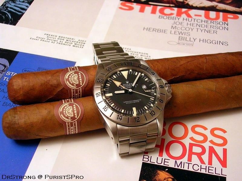
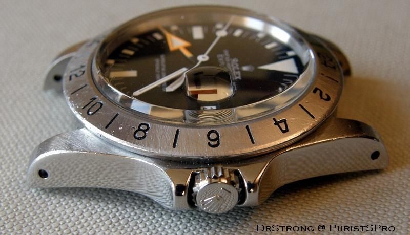
Here’s an early example of a Freccione, where you notice the specific “swiss” dial, the straight second hand and the first type of bezel:
here’s a view where you notice the specific shape of the early crown guards:
and a different angle to appreciate the various aspects of the watch:

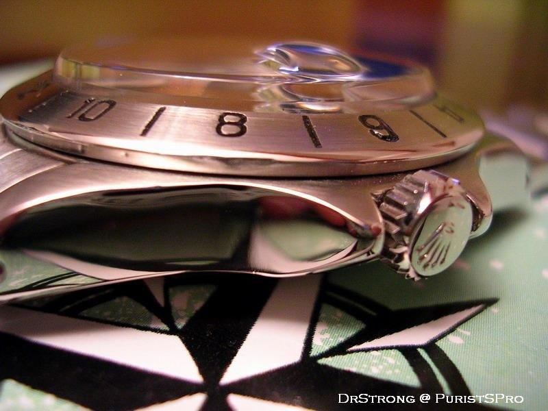
In 1974, the design of the watch is slightly modified: the crown guards get bigger and a new type of dial (rail dial) is fitted to the watch.
In 1974/75, a new bezel appears (thick font centered) until 1977 when it changes again ("thin font full").
Between 1977 and 1978, the dial is changed again, especially the shape of the coronet and the bottom of the dial which now reads t swiss < 25 t.
A final version of the dial is introduced in 1979 and a final version of the bezel ("thin font reduced") in 1980.
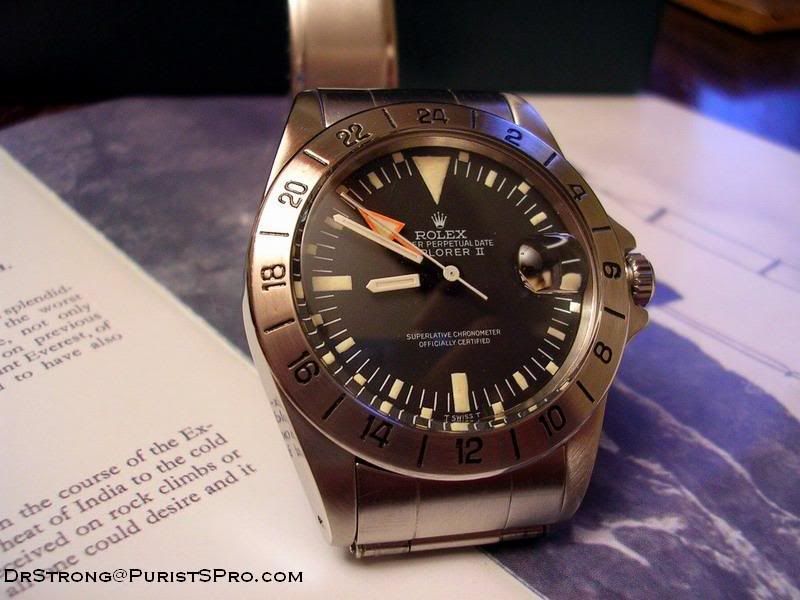
Here’s a late 1970’s watch, where you see the Mk4 t swiss < 25t dial and "thin font full" bezel.

it is obvious on this picture that the crown guards are much thicker than on the early 1970’s watch:
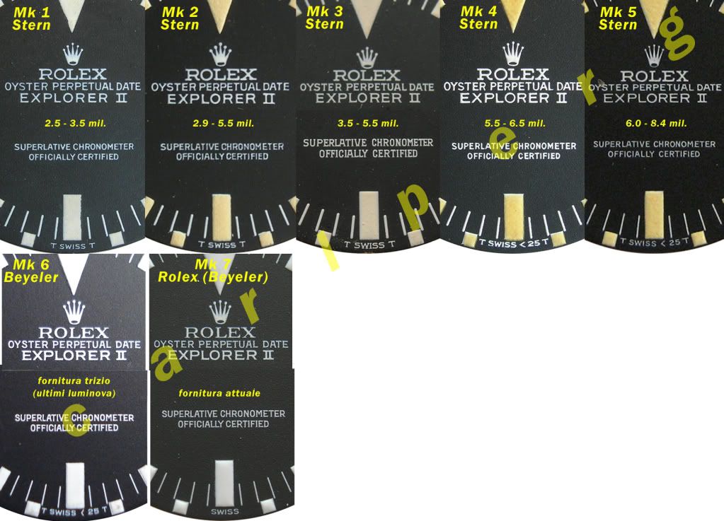
Here’s a detailed chronological list of the dial versions that has been established by Carlo Pergola and Antonello Niceta:
• Mk1 1971-1973
• Mk2 1972-1977
• Mk3 ( rail dial) 1974-1977
• Mk4 1977-1980
• Mk5 1979 – 1984
• Mk6 replacement, tritium
• Mk7 replacement, luminova
And a picture by these authors to illustrate the differences between the dials:
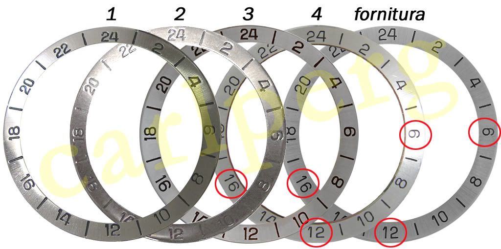
Here’s a summary of the evolution of the bezel:
1. thick font top, seen with Mk1 and Mk2 dials between 1971 and 1973
2. thick font centered, seen with Mk1, Mk2, Mk3 dials between 1973 and 1977.
3. thin font full, seen with Mk4 dial between 1977 and 1980
4. thin font reduced, seen with Mk5 dials after 1980
To conclude, here are the mandatory vintage ads featuring the Explorer II, that illustrate so well the philosophy of the watch:
Comments
Post a Comment